Platforms… Part2
Earlier I posted on my instagram account, as well as here, talking about the recent changes to the instagram user interface.
At the time I assumed that these changes were self-evident to everyone, not realising that the update has not been rolled out universally. As a result, I have received questions, comments and messages, the volume of which at this point exceeds my ability to reply - for which I apologise!
I did not intend to be cryptic or abstract in my original post. And so I hope this follow-up explains things more concretely.
Several days ago, instagram rolled out an update of its user interface - which you can read about in this article.
Apparently, this update took place only for a subset of instagram users. Whether this was done on a regional basis, or at random, I do not know. But at any rate, I am one of the users for whom the update took place.
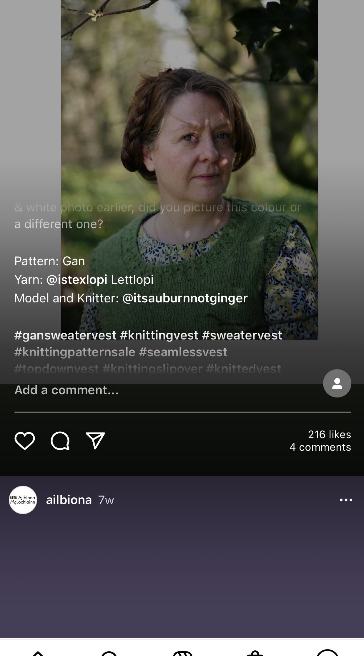
In the new interface, ‘Posts’ look similar to the current appearance of ‘Stories,’ but with a more interactive element - including scrolling text, animated drop-down menus, and flashing hashtags.
The Posts now also include colourful borders around the images in order to fill the 9:16 image ratio format. The user has no control over the borders’ existence or colour. For example, it is not possible to change the borders to white or black, so as to make them appear invisible. Neither does instagram offer an option to upload images in the 9:16 ratio to begin with, in order to avoid borders entirely.
I am posting a couple of screenshots attempting to show all this, but really this is insufficient as the still shots fail to capture the cumulative experience, especially when scrolling through a stream of images.
The overall effect is a visual mess of jumbled colour and often illegible text, with one post fading into the next without clear distinction.
For me, the new layout is problematic on several fronts.
Firstly, it destroyed instagram’s USP as it were (Unique Selling Point), which was its clean, minimalist, and uncluttered image display format.
But having said that, the change in aesthetics is the least concerning part of the new format. The text overlapping with imagery is detrimental on two fronts: It makes the text largely ineligible, and at the same time it obscures the content of the images. Aesthetics aside, this is a functional problem, and an information-delivery problem. And of course for anyone with reading comprehension issues, dyslexia, sensory issues, migraines, epileptic disorders, etc., the flashing scrolling text and cacophony of colours, is a recipe for disaster.
And because I am prone to some of the above, I cannot use the platform in its current form for any length of time.
With that being said, there are a few things I would like to clarify in response to some of the questions and comments I have received:
1. Despite my altogether negative user experience, I am absolutely not critical of instagrams’s decision to update their platform to this new interface. I am critical of my own passivity, especially considering that I’ve had a vague awareness for some time that something like this was bound to happen. That is what I was trying to express in my previous post. Instagram is a for-profit business, a 3rd party platform. They have a right to make whatever changes they want to their interface, and for me to feel somehow betrayed by the change would be silly and naive.
2. For those tech-savvy folks out there sending me messages… Please guys. There is no need to Explain the update to me. I understand the whole ‘immersive experience’ thing. I keep abreast of industry news, and as I mentioned in my previous post I was actually aware as early as a year ago that instagram has been planning a change like this. To be honest, I ancitpated this was coming as soon as it was purchased by Facebook. Hence, once again, my frustration/ disappointment with myself at not doing anything about it sooner.
3. In response to comments along the line of ‘No one likes when platforms Change, but we get used to it and then we usually like the New Look even better’ …In a majority of cases, I would be inclined to agree. I am not a technophobe, and I do not grump about software/ platform updates by default. But in this instance, what I am experiencing is not just a change, but outright bad design - for all the reasons I described earlier. Unless it is tweaked to resolve all the problematic aspects, I absolutely will not get used to it, but will have no choice but to move away from the platform - just as I moved away from Facebook in 2010 (despite being one of its first users, due to my academic affiliation!), and just as I moved away from Flickr several years later.
So… in the (granted, unlikely!) scenario that someone from instagram is reading this, I hope this is a useful datapoint from an early tester of the update. My viewership is down, my interactions are down, my clickiness is down. And I am scrambling to find a way to remove myself from the platform entirely.
And for others reading this, my apologies for the rant! But you wanted details/ an explanation of what I was alluding to in my earlier post, and so here it is.
Getting back to the point I was trying to make in my original post… When we use 3rd party platforms, I think it’s important to recognise that we put ourselves at their mercy. And when we use 3rd party platforms that are super-cool, and helpful, and nearly seem too good to be true… Well, let’s be realistic: It is only a matter of time before the other shoe drops. And we do not know what that shoe will look like, and where that shoe will land.
And with that headache-inducing metaphor, I bid you a Good Evening… and promise the next content here, will be knitting related!


